What makes the Story of Stuff so appealing? (despite content that increasingly frustrates). It is basically a talking head with some animated diagrams: essentially a lecture with a whiteboard.
This has been a passion of mine for a while. Lecturers are challenged to deliver courses in new ways: online; distance; asynchronous; interactive. Yet for many, nothing beats the passion, immediacy and engagement of the traditional classroom. The challenge is to translate those skills to new media. Leigh gives some examples of new ways of presenting the traditional lecture. The danger of simply videoing a lecture is the worst of both worlds – a boring lecture with no interactivity.
Last year we explored ways of adding value to captured video of a small class lecture. The challenge is to add interactivity to aid learning while still being feasible for busy academic staff. Two students of mine (Tri Nguyen Boyd Sirinukul) worked with Terry and Leigh to add value to a short lecture by our colleague from Engineering: Kevin McClean.
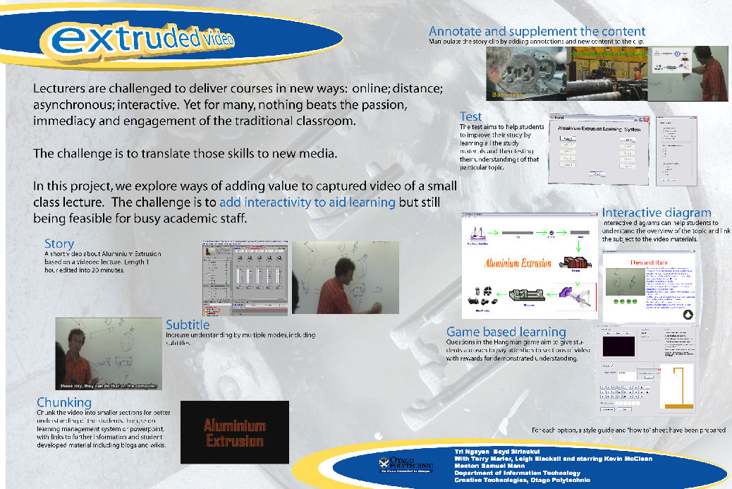
We tried several methods of adding interactivity with a strict time constraint for each method. Each result we assessed against a rubric of meeting learning needs (plans to formally test this were defeated by graduating students getting jobs!). Of the methods more complex than subtitles and simple annotations, the most successful was a interactive diagram: the diagram being used essentially as a visual index to short videos about the appropriate section of the process. A system of multichoice questions linked to the video and a game (hangman) were also  successful but more time consuming.
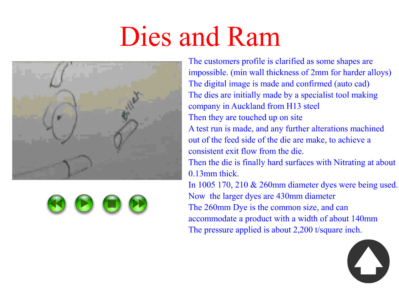
A few years ago a different student group undertook an analysis of how people used whiteboards in telling formal stories (pdf). We asked educators to describe their programme with the use of a whiteboard. We captured these stories and analysed them for common structures, borrowing a constructivist storytelling model from our colleagues Maxine Alterio and Janice McDrury. They describe a level f engagement model, whereby both storyteller and listener benefit from participating in critical reflective dialogue. Together the participants progress through five stages:
1. connecting with context (rapport with listeners),
2. telling the story (motives, words or events depict their point of view, substantiated through tone of voice, points of emphasis and gestures),
3. clarifying events,
4. engaging in critical reflective dialog,
5. (hopefully) constructing new knowledge. They describe storytelling as constructivist – a learning a process of sense making of adding and synthesizing new information within existing knowledge structures. To be considered
constructivist, four important tenets should be present: context, collaboration, conversation, construct.
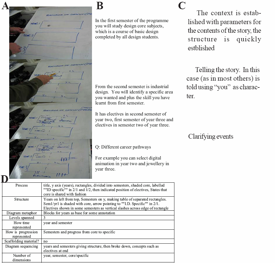
Most of the finished diagrams were very difficult to understand yet if sequence followed the meaning becomes
more apparent. Despite this, versions of these diagrams are widely used in curricula and marketing documents. Some
of them, despite being tidied for publication are complex and difficult to understand. Without the dynamic elements inherent in the whiteboard delivery their educational quality is limited.
What has this storytelling based dynamic visualisation got to do with sustainability?
A couple of weeks ago we sat down to finalise our sustainability strategy document. It has seven sections (operations, communities, research, curriculum, communications, staff development, student participation). Each has formally written objectives, targets and responsibilities. I didn’t like the structure and argued for some time that this linear and compartmentalised model was wrong – all the interesting bits are in the interactions between these categories. So, we started to draw a diagram to explore this idea. After several false starts (venn diagrams, concentric circles, spokes) we settled on a web. We put the seven areas around the outside and then added linking lines between each one. We then worked to identify the nature of each relationship – in many cases there is more than one. In some cases, we couldn’t immediately find a relationship, and this became a driver for the strategy – perhaps this is a gap that needs addressing.

Towards the end of the meeting, we decided to move the student participation to the centre of the diagram (reflecting this as the essence of what we do).

Over lunchtime Paula and I converted the diagram to Visio, and printed them out in time for another meeting in the afternoon. These were largely discarded though – the model on the whiteboard was used extensively to structure that meeting. Perhaps the informality of the whiteboard better suggested a “work in progress” (and perhaps sustainability always should be).

We now have the task of explaining our strategy to all staff. We think this diagram is key, but not in its present state – as a static model it is too impenetrable. So I’m going back to the dynamic visualizations and working out how we can tell our story, leveraging this diagram in a participatory, interactive, constructivist manner.

leighblackall
December 17, 2007
I’m “mentoring” a couple of designers as they prepare concepts for a project for the marketing department. I’ve been encouraging them to create quick mock ups or video scenarios that explain their ideas. They have one up already. Notice my comments that point to the examples from Finland and Sweden where video scenarios seem to be a popular way to present ideas. Other inspiring examples include the MobilEd Scenarios
dave
December 17, 2007
While recording a lecutre just doesn’t work, I’m wondering more and more about interviews or rather – two people engaging in a prepared discussion. The preparation is very necessary so it doesn’t wander aimlessly the way the SIT TV programmes seem to.
I don’t know how to pull it off but this interview + whiteboard format works really well check out this video. If you watch it, you might be surprised how much you learn about windows kernel, a topic I know isn’t your passion (there’s no skill/technique needed to teach someone about a topic they’re passionate about).
Couple that with demonstration (e.g. camtasia), animation (a la story of stuff), pre-made bullet points (ppt) and you would have a valuable presentation.
The only drawback to all of this is the time needed to develop a reasonable thing which someone would sit through. There’s a reason why GOOD training materials are expensive – Example CBT Nuggets.